The Importance of Responsive Design for Your WooCommerce Store
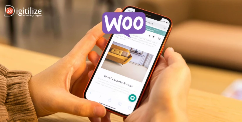
 Thanks to the rise in the number of people accessing the internet via mobile devices, responsive stores have become increasingly popular in recent years. If your WooCommerce store isn’t optimised for mobile devices, you’re losing out on a significant portion of visitors. For eCommerce, the importance of responsive design for your WooCommerce store to increase the sales and profit. As a result, a responsive web design is just a responsive WooCommerce store design. When viewed on a desktop computer, laptop, smartphone, or tablet, the automatically adjusts its size to fit the screen.
So, you need to know why responsive design matters for WooCommerce store. Ensuring your store looks great across all screen sizes and shapes is essential to delivering the best possible user experience. It is crucial to create a store with a responsive design because of this.
Thanks to the rise in the number of people accessing the internet via mobile devices, responsive stores have become increasingly popular in recent years. If your WooCommerce store isn’t optimised for mobile devices, you’re losing out on a significant portion of visitors. For eCommerce, the importance of responsive design for your WooCommerce store to increase the sales and profit. As a result, a responsive web design is just a responsive WooCommerce store design. When viewed on a desktop computer, laptop, smartphone, or tablet, the automatically adjusts its size to fit the screen.
So, you need to know why responsive design matters for WooCommerce store. Ensuring your store looks great across all screen sizes and shapes is essential to delivering the best possible user experience. It is crucial to create a store with a responsive design because of this.
What is responsive design?
A responsive design ensures your WooCommerce store looks great on any screen size. It eliminates the need to create and manage separate versions for mobile and desktop. Whether viewed on a mobile phone, tablet, or desktop, the store adjusts to fit the screen perfectly.
With a responsive WooCommerce store, users won’t need to zoom in or scroll sideways to see the content on smaller screens. It provides a smooth, user-friendly experience on all devices.
The Importance of Responsive Design for your WooCommerce store
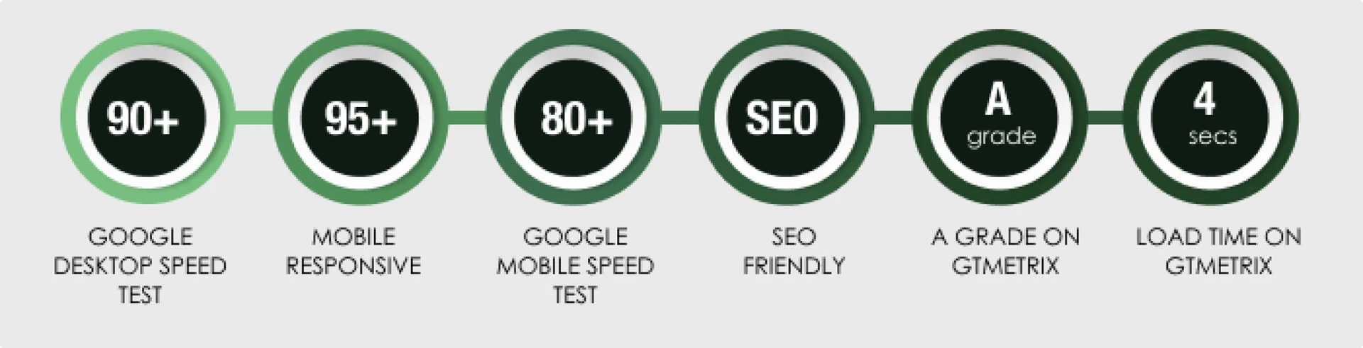
An essential part of every profitable online store’s marketing plan is search engine optimization. The SEO ranking of your shop can be greatly impacted by a flexible design. Mobile friendliness is a factor that search engines like Google consider when ranking search results.
When it comes to visibility and organic traffic, having a responsive design may make all the difference to your WooCommerce store’s ranking higher in search results. when the first page of search results features your shop. Potential clients who are actively looking for goods or services in your specialty are more likely to find them. In addition, Google now employs a mobile-first indexing strategy, which implies that a website’s ranking in search results is mostly determined by its mobile version.
The key to the success of your WooCommerce business is to reach as many people as you can. Customers utilize a variety of devices these days, such as laptops, desktop computers, tablets, and smartphones, to access the internet. Your website must be usable and available on all devices if you want to draw in these varied consumers. Your online business will be more inclusive and accommodating if it can accommodate this large range of devices, which is ensured by responsive design. Irrespective of whether a prospective client is using their tablet on the couch, their desktop computer, or their cell phone when driving. Your WordPress store will be user-friendly and entertaining. With this increased reach, you may reach out to demographics and market segments that you would not have otherwise considered.
-
A higher percentage of customer retention
Customer retention is crucial for every type of business, online or off. Customers may choose to return if they consistently have a positive online shopping experience from your store. Furthermore, studies show that clients are 50% more willing to try a new product from you if they have previously had a great experience with your brand. Building a devoted audience might benefits of responsive design for online stores from higher customer satisfaction brought about by your ability to engage readers with your content.
-
Improved Information and Analysis
Businesses wishing to better understand their clients and enhance their marketing and sales tactics will find that data is an invaluable resource. The process of gathering and evaluating user behavior data on your website can be facilitated by responsive design. You just need to keep an eye on and evaluate one version of your website when it is responsive. This makes it easier to track user activities and gather information. You may learn a lot about the preferences, actions, and trends of your consumers by using tools like Google Analytics. You may monitor, for instance, the screen sizes and devices that your consumers use most often to access your business. By prioritizing optimization for the most popular devices, you may make decisions based on this knowledge.
Fastness is important in the digital era. Optimized page loading speeds and responsive design best practices for WooCommerce go hand in hand and are essential for keeping users on your site longer and lowering bounce rates. Customers have little patience for slow-loading websites, especially when using mobile optimization for WooCommerce stores, therefore they want websites to load promptly. You can satisfy enhancing customer experience with responsive WooCommerce themes and provide fast access to items and content with the aid of a responsive WooCommerce shop. It’s critical to keep in mind that the opposition is only a click away. Potential clients may leave your business in favor of a speedier one if your website is too sluggish.
An online store’s development and upkeep may be expensive, so investing in a responsive design now might pay off later. If your website isn’t responsive, you might have to build and maintain many versions that are optimized for various screen sizes. On the other hand, a responsive design lets you manage a single website that changes to fit multiple devices, which saves money and streamlines your operations. This saves you time and money since you simply have to handle one set of functionality, design, and content. In light of the market’s constantly expanding selection of gadgets and screen sizes. Because the responsive WooCommerce themes for better UX keeps your store flexible without requiring constant development and redesign, it’s an economical option for your company.
It’s time to evaluate your stores right now. Have you worked with a WooCommerce responsive store? If you respond “already,” you should continue making website improvements to please visitors. Saying “NO” indicates that you need to seek professional assistance. Since they understand how to use the design to make the business successful, our WooCommerce developer would be the finest choice for you.
How to Improve Your Mobile WooCommerce Experience?
-
Verify the mobile-friendliness of your website.
Test the responsiveness of your website first, and then continue to evaluate its mobile-friendliness regularly. The performance of your website on mobile devices may be tested with specialized hardware and software. Optimizing the media and content for the same may also be necessary. Utilize mobile-friendliness testing tools like Google Search Console, and make sure your website is always up to date. You may evaluate your website’s mobile performance here by simply entering its URL. Fix any problems and double-check the updates to ensure your website is error-free.
The first step to improving WooCommerce store performance with responsive design is to use a WordPress theme that is optimized for mobile devices. Although some may have already started, you should start without hesitation with this essential step right now. The two main characteristics of mobile-friendly WooCommerce store design themes are their lightweight design and usage of responsive web architecture. Thus, having a responsive store enables your pages to change dynamically according to the user’s screen size.
Any WooCommerce store must constantly put a strong emphasis on its visuals. It is no secret that buyers focus a great deal on product photos because they enable them to see the thing they want to purchase. However, because they often have greater file sizes, incorporating higher-quality photographs might also be a bit of a challenge. Therefore, a slower loading time is correlated with larger file sizes. You must thus optimize your photos if you want a mobile visitor’s experience to be speedier. One kind of picture optimization that is frequently utilized is compression, which lowers the size of the image file.
A website’s store navigation is a crucial component. For the site’s potential users, providing an intuitive, understandable, and simple main menu may be a game-changer. Because there isn’t much screen real estate on a mobile website, the menu’s layout is crucial. For WooCommerce stores, maintaining a simple menu allows users to navigate quickly and locate the information they are seeking with fewer clicks.
Is there too much emphasis on responsive design?
Naturally, there is no such thing as a flawless design or marketing strategy, and responsive design is no different. Cons of responsive design include the following:
It might be challenging to provide different content to various consumers based on the device they use, even on flexible websites. With banner advertising or scaled adverts, you can have issues.
It could be challenging for you to independently develop a responsive website that is distinctive and true to your branding. However, responsive design is not the only type of design that has drawbacks. This is the optimal method, as evidenced by the vast majority of responsive website data. For instance, 61% of mobile visitors claim they would quit your website right away if they are unable to discover what they are searching for or if the content fails to load.
Therefore, the vast majority of Internet users choose the importance of responsive design for your WooCommerce store, despite its shortcomings since it makes mobile surfing much easier. So, if you are looking for the expert’s help consider our web design and development service in UK. To know more follow us on LinkedIn.
Frequently Asked Questions
Every theme available on WordPress.com is responsive. This implies that your website will load precisely how you want it to on desktop, tablet, and mobile devices regardless of the theme you choose.
The same team that created the well-known e-commerce platform WooCommerce also created the free WooCommerce Storefront theme. As a result, it has tight integration with both WooCommerce and the most widely used extensions for customer interaction. Because of this, it's a great theme to utilize for creating your first online store or marketplace.
The theme you are using is Slow. Your store's and website's design greatly influences how quickly they load. Your WooCommerce store is probably being slowed down by a WordPress theme with poorly optimized code or a design that has a lot of resource-intensive elements, such as sliders, videos, and animation effects.
The good news is that there is no cap on the quantity of goods you may add to your WooCommerce site. Consequently, it can set up and maintain websites that sell more than 5,000 or even 10,000 goods with ease.
Actions are used to launch custom scripts at a designated moment when WordPress Core is running. Data that is utilized by other processes can be altered or customized using filters.
The creation of WordPress themes and plugins starts with hooks. They serve as sites where developers may 'hook' their own code into WordPress at particular points to modify essential functions without having to alter the core files.

 Thanks to the rise in the number of people accessing the internet via mobile devices, responsive stores have become increasingly popular in recent years. If your WooCommerce store isn’t optimised for mobile devices, you’re losing out on a significant portion of visitors. For eCommerce, the importance of responsive design for your WooCommerce store to increase the sales and profit. As a result, a responsive web design is just a responsive WooCommerce store design. When viewed on a desktop computer, laptop, smartphone, or tablet, the automatically adjusts its size to fit the screen.
So, you need to know why responsive design matters for WooCommerce store. Ensuring your store looks great across all screen sizes and shapes is essential to delivering the best possible user experience. It is crucial to create a store with a responsive design because of this.
Thanks to the rise in the number of people accessing the internet via mobile devices, responsive stores have become increasingly popular in recent years. If your WooCommerce store isn’t optimised for mobile devices, you’re losing out on a significant portion of visitors. For eCommerce, the importance of responsive design for your WooCommerce store to increase the sales and profit. As a result, a responsive web design is just a responsive WooCommerce store design. When viewed on a desktop computer, laptop, smartphone, or tablet, the automatically adjusts its size to fit the screen.
So, you need to know why responsive design matters for WooCommerce store. Ensuring your store looks great across all screen sizes and shapes is essential to delivering the best possible user experience. It is crucial to create a store with a responsive design because of this.
 Customer retention is crucial for every type of business, online or off. Customers may choose to return if they consistently have a positive online shopping experience from your store. Furthermore, studies show that clients are 50% more willing to try a new product from you if they have previously had a great experience with your brand. Building a devoted audience might benefits of responsive design for online stores from higher customer satisfaction brought about by your ability to engage readers with your content.