
Your Website Need a Mobile Makeover?
Absolutely, yes! In this mobile-first world, it’s crucial to have a website need a Mobile Makeover. A mobile-friendly site improves user experience and boosts your SEO ranking. Businesses today must have an internet presence! That is only possible with the help of a website, but that website must be mobile-friendly is quite tricky. Most business professionals work hard to build an effective company website yet frequently fail to draw in most viewers. The fact is that many smartphone users won’t even try to visit a company website that isn’t mobile-friendly. Furthermore, why would they? Most likely, they can return to the search results and go to one of your competitors’ websites that is easy to use for businesses. Consequently, an intelligent business owner would always respect a mobile-friendly website. A website need a mobile makeover is beneficial for the following reasons: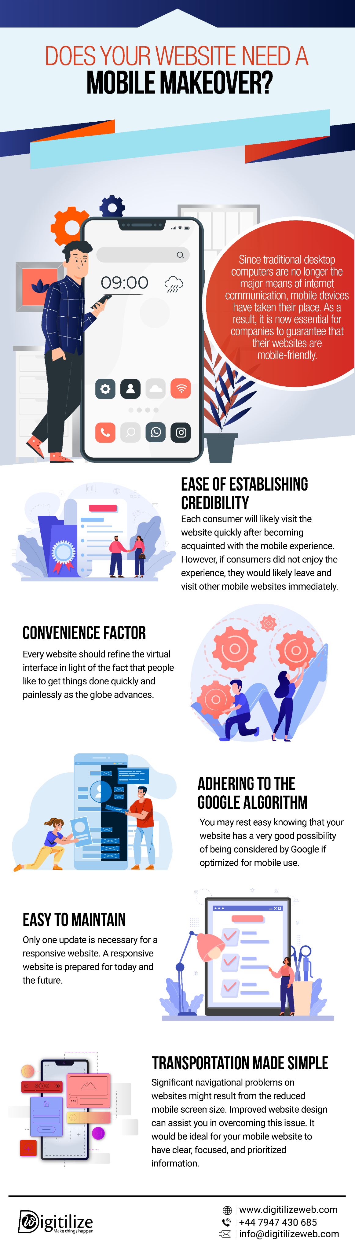
- Ease of establishing credibility
- Convenience Factor
- Adhering to the Google algorithm
- Easy to maintain
- Transportation made simple
Additional Tips!
Now you know the advantages of having a mobile-friendly website, but that’s not enough. Developers must make the proper process to have an excellent mobile-optimized website. Therefore, we DigitilizeWeb, also provide you with some tips that might help you:- Keep a responsive layout, so the website may adjust the size to meet the user’s device.
- The conversion rate of a website that loads in one second is three times higher than one that loads in five seconds.
- Images can be compressed to minimize the amount of data that must be loaded before viewing, accelerating website performance.
- Skip the pop-ups! This functions properly on desktop browsers but not on mobile devices.
- Maintain a font size of at least 14 pixels since smaller screens may make a desktop font too tiny to read.
Final Verdict
In this digital era, mobile devices dominate the world! Thus, to have a successful business, one must diversify their website if needed. Take advantage of the mobile revolution by ensuring your website is mobile-friendly and can interact with and engage your target audience.FAQ
Frequently Asked Questions
You may use Weebly's iOS and Android applications to construct a mobile website.
Indeed, you may create a website for free using one of the website builders available. For further information regarding publishing and upgrading your website pages, make sure you read their terms of service.
You may use Google's Mobile-Friendly Test tool to see whether your website is optimised for mobile devices. The tool just requires you to input the URL of your website to determine whether it is mobile-friendly and, if not, to receive ideas for making improvements.
Having a mobile-friendly website will indeed help you rank higher in search results, especially because Google and other search engines give preference to these types of websites when displaying results for mobile users. Google's mobile-first indexing algorithm also takes into account a design that is responsive to mobile devices.
Your photos will grow on the phone to appear at the proper size relative to the rest of the content when each pixel on the screen is smaller. When an image is enlarged beyond 100% of its original size, it appears pixelated or fuzzy.
A mobile-responsive website adapts to various screen sizes and devices, providing a consistent and user-friendly experience across platforms. Benefits include improved user satisfaction, increased mobile traffic, higher conversion rates, and better search engine visibility.