The Role of Colours and Typography in UK Web Design

Colours and typography shape how users feel and interact with a website. In UK web design, developers know that these elements can guide users and create emotional responses. The right colour and font choices make websites easier to use and more memorable.
To create a visually pleasing design, web designers must fully understand colour theory and typography rules. These tools help them express the tone and vision of the brand clearly. In 2025, mastering these basics is no longer optional, it’s essential for building great websites. Therefore, we will discuss the role of colours and typography in UK web design in this blog article.
Understand the role of colours in UK web design
Scientists have kept researching the psychology of colour and its effects over time. But even just looking at us shows how much of an influence colour has on our surroundings. When employed properly, colour and legible typography may be considered the two most crucial elements of a website’s design. Therefore, choosing the proper colour scheme early on in the project is crucial. It should preferably just include two or three hues to avoid overwhelming customers with too complex a website design. The following categories often contain the most popular colour schemes:
- Monochromatic refers to the usage of colours or tints from a single colour.
- Analogous colouring is the practise of using hues that are next to one another on the colour wheel.
- The colour wheel produces complementary combinations when two colours are opposite each other. For situations requiring a high degree of contrast, these are excellent.
- Split-complementary colour scheme: this palette combines two opposed colours, similar to the complementary colour scheme, which employs the opposite colour.
- A triadic design consists of three hues that have an even distribution over the colour wheel.
- Tetradic, or the rectangle is a pattern that employs four colours. This gives the design a great deal of flexibility.
The Role of Colours and Typography in UK Web Design: Colours
-
Provide the Users’ Focal Point
Making a user’s focus point on a website is one approach to utilizing colour efficiently. It’s common practice to highlight some significant parts on a website using primary colours like red, yellow, and blue. In contrast, these features will be complemented by the usage of additional secondary or tertiary colours. By carefully choosing various colours and tones, designers may produce certain visual effects. These elements, which direct users around the website and motivate them to act, include contrast and depth.
-
Style Your Brand Identity
Colours play a big role in website design. They help brands show who they are and stay consistent across all pages. When companies use their brand colours on their website, it strengthens their message.
For example, Apple uses clean black and white themes that match its sleek product image. McDonald’s uses its famous golden arches and red-yellow colour scheme to stay true to its brand. These choices make their websites feel familiar and trusted. In 2025, smart use of colour in website design is key to strong brand identity.
Users’ online surfing habits can also be influenced by colours. Warmer tones increase customer enthusiasm more than cooler ones, according to studies. This implies that when creating a website, designers should think about the feelings they want people to experience. Depending on whether it’s soothing, cosy, or invigorating, decide on the right colour scheme. In a similar vein, vibrant, vivid colours typically boost levels of interest more than subdued hues. Therefore, bolder colour schemes may be used instead if better involvement rates are needed.
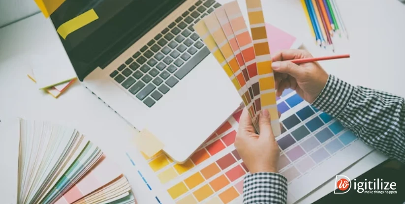
Colour terms you should know for web design
We are concentrating on colour in this discussion on the role of colour and typography in UK web design. With over 16 million colours to choose from, creating a website may easily become overwhelming. You have almost endless possibilities when you have such a wide range of selections. Having a basic understanding of colour terminology and properties will aid you in making wise design choices.
A useful tool for seeing colour relationships in a traditional, schematic way is a colour wheel. There are twelve colours in the basic colour wheel. All additional colours are derived from primary colours. Though current research indicates that Magenta, Cyan, and Yellow are more accurate descriptions of how humans see these colours, conventional theory labels these as Red, Blue, and Yellow.
When primary colours are mixed, orange, green, and purple are produced. We refer to these as secondary colours. In order to make tertiary colours like yellow-green, blue-green, and so on, you may also mix primary and secondary colours.
Warm colours are those with higher concentrations of red and yellow. They might look aggressive and arouse thoughts of danger, yet they can also arouse feelings of desire, enjoyment, and heat. They are frequently used in alert messages because of this.
On the other hand, blue and purple are more prevalent in cool hues. The sky, icy regions, and pure waterways all come to mind while looking at these hues. Compared to warm colours, they are seen to be more calming and restful. They may, yet, also imply formality and melancholy.
Including neutral hues like grey, black, and white might assist you in creating a balanced palette. They may offer contrast to your designs and balance out your colour palette.
Any website needs contrast, but it’s especially important for background colour and content. Users are more prone to struggle with element differentiation if the contrast is too low.
Pages should be kept neat and orderly by using a dark font colour on a white backdrop for readability. Conversely, you may also try placing a light font on a dark backdrop and inverting the colours. Web designers are now using these two combinations often; many templates and apps provide either a “Dark Theme” or a “Light Theme.”
By incorporating white into a colour, you may produce tints. Lighter hues will result from higher white levels. In a same vein, adding black will result in a distinct tint. The amount of black in a shade increases with darkness. For a monochromatic colour scheme, you can mix tints and hues of the base colour. But with a design like that, it might be harder to make key components stand out.
It is evident how important colour is to web design. If you still have confusion then let us have a look at any website designs you may be working on. Our designers are masters at fusing compelling narrative with eye-catching design ideas to establish a brand that appeals to your target market. As we know the role of colours and typography in UK web design is crucial so, after colour aspect now let’s get into typography.
What is Typography?
Typography is the art of arranging letters and text in a clear and attractive way. It makes content easier to read and understand. Good typography grabs attention and sets the mood of the message. It also shapes how readers feel and think.
In 2025, typography is more than just design. It’s a key part of web and mobile content. Web designers use it to create clean, modern websites that connect with users. Thanks to digital growth, designers now have endless fonts and typefaces to choose from.
Typography helps websites stand out. It guides the eye, adds emotion, and improves the user experience. Whether on a mobile screen or desktop, strong typography makes your message more powerful.
Different elements of typography
Because many individuals use typefaces and fonts interchangeably, it can be difficult to distinguish between the two. Typography fonts is a graphic style made up of several letters with different weights and widths. For example, DigitilizeWeb highlights the Serif fonts may be distinguished by the additional dots at the conclusion of letters. On the other hand, a typeface is a picture of a text character. In a nutshell, a typeface is a collection of linked typefaces, and fonts are the many weights, widths, and styles that make up a typeface.
Similar to hierarchy, contrast aids in making it clear to readers which concepts or messages you want them to focus on. Your writing becomes more engaging, poignant, and visually arresting when you devote some time to contrast. In order to make an impression and break up the page, most designers experiment with different fonts, colours, styles, and sizes to generate contrast.
A jumbled and confused user interface may be avoided by utilising consistent fonts. It’s critical to use consistent font styles when communicating information so that readers can quickly grasp what you’re saying and start to see trends. Establishing and adhering to a consistent hierarchy of fonts is best practise, while it’s OK to experiment with the degrees of hierarchy to some degree.
White space, sometimes called “negative space,” is the area that surrounds text or visuals. Though it’s often hidden from the user’s view, proper use of white space ensures that the interface is clear and the text is comprehensible. In addition to being visually pleasant, white space may even highlight the content. White space frequently appears as padding, margins, or just plain white space devoid of any text or images.
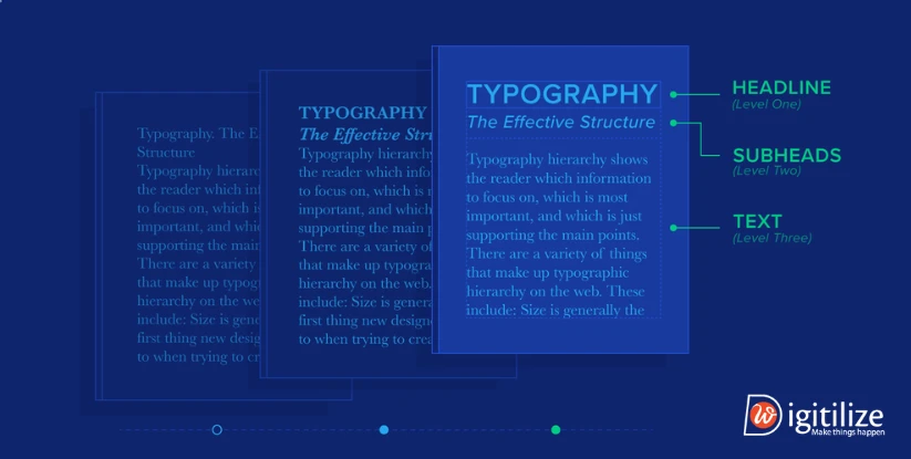
Layout One of the most important aspects of typography is creating a hierarchy. Typographic hierarchy seeks to differentiate between regular text copy and conspicuous copy, which ought to be noticed and read first. In a time when social media has caused people to have shorter attention spans. It recommends that designers use typefaces that allow users to assimilate information swiftly and with succinctness.
The role of colours and typography in UK web design: Typography
-
To Draw in Readers, Make It Readable
Making ensuring that the material is accessible and easily legible for users is the main objective of typography in website design. To avoid eye strain and make reading easy, this entails selecting readable fonts, sensible font sizes, and adequate line spacing.
-
Make Your Elements Contrast Better
In order to draw visitors’ attention and make the information stand out, contrast is essential. It entails choosing the right fonts, sizes, and weights in order to highlight key information and establish a visual hierarchy. When the headline and body text are different from one another, it might be simple to tell them apart.
-
Organisation of Information and Hierarchy
Typography aids in the creation of a clear visual hierarchy that facilitates visitors’ understanding of the organisation and prioritisation of the content. It is possible for designers to direct users’ attention and facilitate better navigation and content consumption on websites by experimenting with font sizes, weights, and styles.
Proper alignment and spacing improve a website’s overall look and readability. Consistent text alignment, together with the use of suitable margins, padding, and line lengths, may improve readability and avoid a crowded visual.
A website’s typography can also convey its personality and brand identity. When typefaces complement a website’s tone, style, and target audience, it will be easier to build a consistent brand image and provide an unforgettable user experience.
Your target audience might form favourable impressions of your website early on if you use colour and typography design wisely. Therefore, the role of colours and typography in UK web design is crucial and important for every web development.
Frequently Asked Questions
Consider factors such as brand personality, target audience preferences, readability, accessibility, and compatibility with different devices and screen sizes when choosing typography for your website.
Yes, brand colors can influence consumer behavior by eliciting specific emotions, attitudes, and perceptions. For example, food brands may use appetizing colors like red and yellow to stimulate appetite and encourage purchase decisions.
Yes, industries often have distinct color associations that reflect their values, target audience, and market positioning. For example, technology companies may prefer modern and vibrant colors, while financial institutions often opt for more conservative and trustworthy hues.
Follow accessibility guidelines such as using high-contrast color combinations, providing resizable fonts, offering alternative text for images, and testing typography with assistive technologies to ensure readability for users with disabilities.
Yes, DigitilizeWeb offers branding services to help clients establish a cohesive brand identity that reflects their values, goals, and target audience.
Absolutely, DigitilizeWeb provides customized branding solutions tailored to your industry and target audience. We can recommend brand colors that reflect industry norms while also capturing the essence of your brand identity and values.

 Making ensuring that the material is accessible and easily legible for users is the main objective of typography in website design. To avoid eye strain and make reading easy, this entails selecting readable fonts, sensible font sizes, and adequate line spacing.