
The Importance of Mobile Optimisation in Ecommerce Web Development

In 2025, shopping on mobile devices isn’t just common, it’s the norm. People shop while commuting, relaxing at home, or even during lunch breaks. Smartphones are always within reach, unlike bulky laptops or desktops.
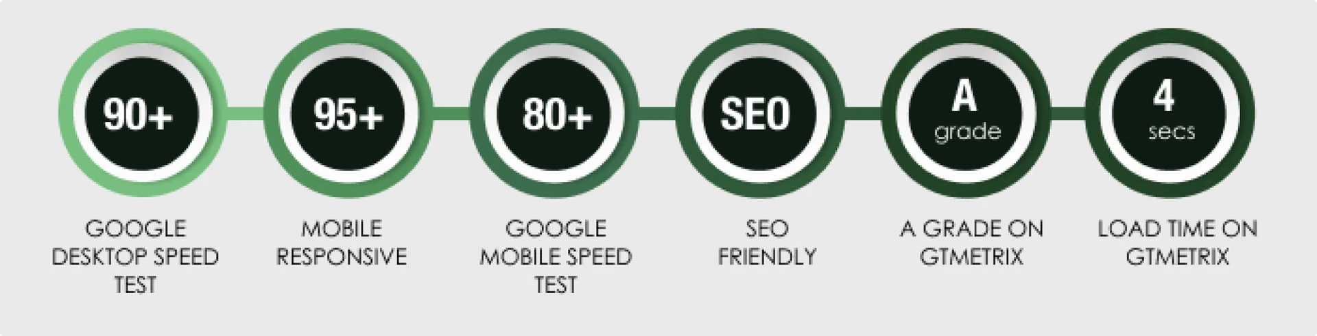
Recent data shows that nearly 95% of users browse and shop online using mobile phones. This means most ecommerce traffic now comes from mobile. If your website isn’t optimized for mobile, you’re missing out on sales.
A mobile-friendly site loads fast, looks good on all screen sizes, and is easy to use. It helps users find products quickly and complete their purchase without frustration. That leads to more conversions and better customer retention.
Google also prioritizes mobile-optimised websites in its search rankings. If your ecommerce site isn’t mobile-ready, it won’t perform well on search engines. That can kill your visibility and traffic.
In short, mobile optimization in ecommerce web development is no longer optional. It’s a must if you want to stay competitive, grow your traffic, and increase sales in 2025.
What is an ecommerce website’s mobile optimisation?
Mobile optimisation for ecommerce sites means designing and developing a website that works smoothly on smartphones. It’s about creating a site that’s easy to use, fast, and visually appealing on smaller screens.
Performance plays a big role here. A high-performing website loads quickly, runs smoothly, and helps users find what they want without delay. These factors keep visitors engaged and increase your chances of making sales.
So, what makes a website perform well? A clean design, lightweight code, fast-loading images, and fewer popups. All these improve speed and user experience.
But speed alone isn’t enough. Responsive design is another key part of mobile optimization. It allows your website layout to adjust based on screen size. Whether someone uses a tablet or a small phone, the content remains clear and easy to interact with.
In ecommerce, this matters even more. If your product pages, checkout process, or menus don’t display properly on mobile, users will leave. Mobile optimization for ecommerce sites ensures that shoppers can browse and buy with ease, anytime, anywhere.
The Importance of Mobile Optimization in Ecommerce Web Development
 For several good reasons, mobile optimisation is essential to an e-commerce business’s success. Ignoring mobile optimization might hurt your online shop in this day and age, when people’s lives are centred on their mobile devices. Hence, the success of an ecommerce firm depends on mobile optimization for the following main reasons:
-
Shifting the Way Consumers Act
-
Enhanced Experience for Users
Mobile-optimised websites give users a smoother experience. Your customers can easily browse products, read content, and complete purchases, without any struggle.
These websites adjust to all screen sizes. Whether someone uses a smartphone, tablet, or foldable device, the layout stays clean and readable. That makes it easier for users to find what they need.
A seamless experience leads to higher satisfaction. Happy visitors are more likely to become repeat customers. They also tend to spend more time on your site and complete more purchases.
So, when your ecommerce site works well on mobile, you’re not just improving design, you’re boosting sales and customer loyalty.
-
Quicker Loading Speeds
Fast websites win in 2025. Mobile users won’t wait for a slow page to load. If your ecommerce site takes too long, they’ll leave and probably won’t come back.
That’s why website speed is a key part of mobile optimization for ecommerce sites. It improves user experience and helps you keep shoppers on your site longer.
Now, with mobile-first indexing, Google checks how your site performs on mobile before anything else. If your mobile version is slow or broken, your rankings will drop.
To avoid that, you need a fast, responsive design that loads in seconds. Compress images, use clean code, and reduce unnecessary scripts. These small changes can help you lower bounce rates and drive more sales.
-
Search Engine Awareness
In 2025, Google puts mobile-first. That means your website’s mobile experience matters more than ever for SEO. If your site isn’t mobile-friendly, it won’t rank well, especially in mobile search results. And since most users search from phones, you’ll miss out on a huge audience.
A website that’s optimized for mobile loads faster, looks better, and keeps people engaged. Search engines notice this. When your bounce rate is low and engagement is high, your rankings go up.
Mobile optimisation for ecommerce sites isn’t just about user experience, it directly impacts visibility. A mobile-optimized site gets more clicks, more visits, and more sales from organic search.
-
A competitive edge
-
Enhanced Sales and Revenue
-
A rise in mobile usage
How to optimise the e-commerce website?
 We are aware of the importance of mobile optimization UK in ecommerce web development, now we have to know how to do that. This article also guides you through the most crucial adjustments for your online business step-by-step. Moreover, in this way, you may increase your clientele, boost revenues, and recoup money from missed sales to visitors who leave.
Update your web pages, landing, and product pages
Ecommerce design trends are always changing. If you don’t update your product or landing pages regularly, your traffic will drop fast. Landing pages are the first thing people see. They shape how visitors feel about your brand. That’s why optimising them is a vital part of ecommerce site performance.If your landing pages or product pages are outdated, users will bounce quickly. A high bounce rate means lost sales, and lost trust. Here’s how you can improve your pages:
-
Offer unique incentives. Give users a reason to stay, like discounts, free shipping, or limited-time offers.
-
Highlight best-sellers. Show your top products right away. Let visitors see what others are buying.
-
Add reviews. Social proof works. People trust real customer feedback more than branded claims.
-
Use high-quality images. Show products from all angles. Let users zoom in and explore the details.
When done right, mobile optimization for ecommerce sites includes refining your landing and product pages to match current user behavior. In 2025, this isn’t optional, it’s what keeps you visible, engaging, and profitable.
Use personalized content
Contemporary consumers desire a highly customised buying experience. For the majority of ecommerce business owners, receiving the “red carpet treatment” is a crucial point of differentiation. You will lose sales if you are unable to provide it. You will lose sales if your customer journeys aren’t tailored to your buyer profiles. The following are some easy actions you may take to optimize your ecommerce:- If your items are offered internationally or in several locations, you may use geo targeting to provide the products in the same currency or with suggestions specific to that region.
- Customising the shopping experience for your customers according to the kind of device they are using to visit your business is a crucial component of ecommerce optimization.
- With the help of DigitilizeWeb Provide your consumers with recommendations and similar items. Product suggestions significantly increase sales.
Use Track tools
With the use of analytics tools, you may monitor key performance indicators (KPIs) and metrics to determine what is and is not effective for your shop. Additionally, you’ll be able to observe which sections of your website drove visitors away, as well as which pages or features encouraged more people to make purchases. You may improve underperforming parts to maximize your conversions by using this data. Every choice you make about e-commerce optimisation must be supported by statistics. Ideally, you can measure customer journeys and your store’s performance by integrating technologies like Hotjar, Google Analytics, and MixPanel into your website. Following are some crucial categories of information you should be aware of:- The stats and KPIs for your store.
- Acquiring your primary routes for acquiring traffic.
- Vital sales information, such as average order value and client lifetime value.
- Any data conversion.
Optimize the mobile audiences
Mobile ecommerce demands increasing day by day, which should help you understand the importance of mobile optimization in mobile ecommerce development It’s evident that the rate of change has accelerated, and mobile e-commerce appears to be well-positioned for future expansion. If your online store isn’t mobile-friendly, you’re missing out. As a result, you must make your online business mobile-friendly. The following actions are what you can do:- Utilize resources such as Google’s Mobile-Friendly Test to assess the information and graphics on your website’s mobile-friendliness.
- To ensure that there is enough room on your website for CTAs and product categories, try not to use too many components.
- It should go without saying that you should always compress your photographs before putting them on your website.