Get a call BackBest web design company in uk

Best 15 Font Styles for Ecommerce Websites


Best 15 Font Styles for Ecommerce Websites

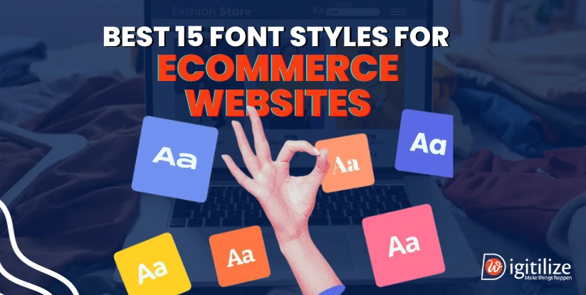
According to the survey, you have between 10 and 20 seconds to grab a user’s interest before they click away from your website. Thus, if you truly want to make the first ten seconds matter, check the best 15 font styles for ecommerce websites. 

Your website’s typography is its voice. Selecting the appropriate font may not only improve message delivery but can also influence tone and even increase brand recognition. Therefore, you should be attentive when selecting typefaces for your company so that they complement your brand and the kind of business you run.

Why does font style matter for ecommerce websites?

Ecommerce websites strive to provide a seamless user experience so that potential customers can easily navigate and comprehend the content on their websites. In order to keep the minimal effort or cost of engagement for consuming material low, they work hard to minimise friction at every stage. Fonts aid in this aim by increasing messaging’s visibility, readability, comprehension, and trustworthiness. 

In addition to doing better on perceived length and cognitive tasks, participants who received high-quality font designs also did so. This is why choosing the appropriate typeface is important. The correct font for business use may entice a reader in, motivate them to read the content through to the end and push them in the direction of a successful transaction.

Best 15 fonts styles for ecommerce websites


Font Styles for Ecommerce Websites

  • Roboto

Known for its professional yet approachable vibe, this typeface is highly loved. It is both visually appealing and useful, which is why millions of websites use it. Its elegant sans-serif style makes it a fantastic option for body content, even lengthy paragraphs. When using clean, straightforward typefaces like Roboto, long explanations might become confusing. It doesn’t appear to be very serious, though. IT companies are able to use it. Roboto complements numerous fonts, including Roboto Slab, Lato, Poppins, Playfair Display, Dosis, and Open Sans.
  • Playfair display

Italicising the Playfair Display makes it extremely click-friendly. Elegant curves and well-rounded edges give this serif font a timeless appeal that works well on both contemporary and traditional websites. Because it is less readable at lower sizes, it is a poor choice for lengthy passages of body material. However, it works beautifully for headings and headers.
  • Verdana

Being readable in small type and on devices with poor resolution makes Verdana an excellent font for usage on screens. This is mostly due to the letters’ large width and spacing. However, you can use this design for typography outside of on-screen displays. This is another best 15 font styles for ecommerce websites. For example, Verdana is used by the well-known furniture firm IKEA on both its online and printed catalogues. This font is a good choice if you’re seeking for an HTML font with excellent readability.
  • Rubik

The typeface Rubik is sans-serif. For titles and headers on websites, this font is perfect. It comes in five weights and five styles. Rubik is a trendy minimalistic theme with a futuristic appearance that works well for product websites. It facilitates fluid product browsing and offers the look of cleanliness. It looks well combined with Roboto and other muted fonts.
  • Script fonts

They are renowned to give businesses a more friendly and individualised appearance, and they typically use cursive typefaces. When utilised correctly, they may convey sophistication and elegance. This is another best 15 font styles for ecommerce websites. It is usually advised, therefore, to restrict the use of this typeface to titles alone. Readers may find it challenging to read texts written in script fonts. Script typefaces are popular and include, for example, Lobster and Lucida Handwriting.
  • Arial

The Arial font is a Helvetica offshoot that was created in 1982 by two well-known and esteemed typeface designers, Patricia Saunders and Robin Nicholas. Classy headlines, logos, and body text frequently choose Arial because of its metric and character widths that are close to those of Helvetica. It can offer your business cards a clear, sharp, and readable appearance and feel since it is available in a variety of sizes, styles, and weights. One of the greatest modern free fonts for business cards is Arial because of its effortless readability.
  • Merriweather

The greatest font option for ecommerce websites that want to convey a high-end brand image is Merriweather. It is ideal for companies looking to forge a distinctive corporate identity because of its refined and exquisite style, which exudes elegance, sophistication, and professionalism. Merriweather’s elegant and timeless style makes it a great choice for companies in sectors where aesthetics are important, such jewellery, fashion, and beauty.
  • Open sans

Steve Matteson designed Open Sans, a warm and welcoming sans-serif typeface. Open Sans is popular for usage in both print and digital projects because of its clear and readable style. This is one of the best font style for ecommerce website. It conveys a modern and polished look and is appropriate for a wide range of applications due to its adaptability and wide range of weights and styles.
  • Montserrat

One of the brand fonts that has a hint of nostalgia in its geometric design is Montserrat. It works well with all text cases—capitals, lowercase, and paragraphs. It is without a doubt one of the most adaptable font designs.  
  • Neue Helvetica

Numerous well-known businesses, including Facebook, eBay, and Yahoo, employ the typeface Neue Helvetica. The font style design type fits nicely with the body and header text fonts and is easy to read. The sans-serif typeface emphasises geometric forms and lines, making it appropriate for headlines and body writing that includes product details. Neue Helvetica is one of its variants; it’s straightforward, easy to read, and suitable for header and body writing. Additionally, 128 distinct fonts in outline, condensed, roman, light, and other styles are included. Helvetica looks great on websites designed by Gibson, Roboto, Lucida Grande, Georgia, and Roboto.
  • Avenir Next

This is one of the fonts for luxury brands is Avenir Next. When it was first released in 1988, the typeface gained popularity very rapidly and is now regarded as one of the greatest sans-serif fonts for usage in graphic design, online design, and website development. It was already a beautiful substitute for Futura or Avant-garde fonts at the time. In addition, it contained six weights at first, chosen primarily on variations in line thickness. This is another best 15 font styles for ecommerce websites. However, when combined with other strong weights, these weights proved to be a prescriptive element in typographic practise. The font, which is a part of the platinum Avenir series and parent design, comes in four typeface parts. Additionally, it is available in six unique stem weight combinations and real tiny caps with the following styles: normal, condensed, condensed italic, and italic.
  • Lato

Lato is an additional sans-serif typeface that is suitable for a variety of websites, despite its commercial design origins. The typeface conveys professionalism while feeling warm and friendly. Regardless of the industry, you may utilise it for your product descriptions to give your company a warm, contemporary vibe. This is another best 15 font styles for ecommerce websites. Originally reused, the font gained popularity as a web typeface. Warm, robust, and legible, it goes well with Playfair Display, Open Sans, Roboto, and Montserrat, among other typefaces.
  • FontSpace

Try FontSpace for a contemporary approach to finding new fonts and types. With over 64,000 typefaces contributed by users and typeface creators worldwide, FontSpace has an enormous library. For those who find it easy to classify and arrange fonts while conducting research, FontSpace is a very easy-to-use, clear, and very enjoyable tool. FontSpace allows users to preview fonts instantly, arrange fonts according to download counts and popularity, and even look for fonts that don’t require further licencing or payments in order to use them straight away.
  • Unblast

Unblast is a distinctive option for this list as it shares and shows typefaces to users before downloading, adopting a somewhat more contemporary style. To help you decide whether a typeface is appropriate for your personal brand and the logo you imagine for your business, Unblast allows you to see fonts on a variety of backdrops and with unique designs. This is another best 15 font styles for ecommerce websites. Unblast may be used for purposes other than merely exploring and downloading fonts. In addition, Unblast offers insightful information on particular fonts and typefaces depending on the industry and/or profession you intend to utilize your new fonts to represent.
  • DaFont

DaFont is a great starting resource for people who are new to the world of fonts and typefaces, as well as for those who are experimenting with fonts and pushing the boundaries of their creativity. Thousands of typefaces are available on DaFont, with categories for style, appearance, and topic. We can quickly download both paid and free fonts from DaFont, which makes it one of our top choices for discovering a new font for any project or web development endeavour.

Now, as per the expert of DigitilizeWeb, these are the best 15 font styles for ecommerce websites. But how to find yours best font? No worries! Lets check below to know your suitable font. 

How do you choose the modern fonts for ecommerce site?


How do you choose the modern fonts for ecommerce site?

Choosing one from the best 15 font styles for ecommerce websites may be challenging. Especially with the wide variety of possibilities accessible online. In light of the above, the following elements should be taken into account prior to choosing and using the ideal typefaces for your company.
  • Consider brand identity

Maybe the most important factor in differentiating one brand from another is its identity. Because of this, you should pay particular attention to how well a typeface fits with the overall aesthetic of your company when choosing it. Consider the feelings you want your clients to experience. Is it elegant and refined or whimsical and fun? You may choose the ideal typeface for your brand based on this.
  • Imagine the point you want to make.

Visualising the message you want to get through to your target audience may also help you choose the appropriate font for website projects. Are you attempting to attract walk-through and commercial clients for a nearby service provider? It will help to visualise the message you want to deliver with your new endeavour in order to select a typeface that is truly relevant and fitting for your business. It helps a lot to have a clear message and tone for your brand and company. Choosing the right font and typeface for your online presence is just as important as creating a logo or website.
  • Readability

Conversions are necessary to propel corporate expansion. The visitor is likely to quit your website if the text fonts are difficult to see or take too long to load. Additionally, material should benefit consumers in some way. The typefaces are just as crucial as the writing style when it comes to readability. Make sure the brand typefaces you select are readable, attractive, and consistent with your brand.
  • Think about legibility

One of the most crucial considerations when choosing a typeface is legibility. To ensure that your readers don’t have to use more time or effort deciphering the content, your font should be sufficiently clear and readable. Because beautiful fonts are difficult to see in huge paragraphs, the easiest method to achieve this is to absolutely avoid using them. If you must use these ornamental types, keep them to headings and titles alone.  Selecting a typeface that works with all weights and sizes is also crucial. Hence, this will assist you in keeping the ideal ratio of readability across all sizes.
  • Use max 2 fonts for business

The fonts that are have to have a good visual appeal. As a general guideline, you should never combine more than two or three distinct typefaces. Additionally, the font pair ought to liven up the website. Put simply, for your website, avoid using a very unusual typeface. Let’s keep the font selection simple. A page that has too many typefaces will appear crowded.  Choosing two coolest free fonts is what you would mostly do for an ecommerce website. A separate one is used for the body text and a header. Ideally, you should only use two different font styles.
  • In paragraphs, avoid using all capitals.

It could seem wise to underline specific passages in your text with all capitals. But too much of it might be detrimental rather than beneficial. This is mostly due to the fact that capital letters are difficult for the human brain to comprehend, particularly in lengthy paragraphs. The reading becomes significantly slower as a result, and eventually your readers become disinterested. Thus, limiting the use of capitalised letters to headlines and titles is the recommended course of action in such situations. This will enable you to guarantee that your site visitors have a seamless and trouble-free reading experience in addition to making an impact with your headlines or titles.

FAQ
Frequently Asked Questions

For a clean and professional look on your Shopify store, consider using fonts like Helvetica, Arial, or Roboto. These sans-serif fonts are easy to read and have a modern aesthetic. Additionally, ensure consistent font usage across your site for a cohesive brand identity that enhances the overall shopping experience.

According to the Copyright Design and Patents Act of 1988, typefaces and letter styles are protected by copyright as artwork.

To add custom fonts to your Shopify store, upload the font files to your theme's Assets folder. Edit your theme's stylesheet (CSS) to include the font using @font-face. Update the font-family property in your CSS styles for specific elements to apply the custom font. Save changes and preview to ensure proper integration.

Fonts that are explicitly labeled as

Consider the emotions and values you want your brand to convey. Choose a font that reflects these qualities, whether it's elegance, professionalism, playfulness, or simplicity. Make sure the font complements your brand's overall aesthetic and message.

Readability is crucial for keeping visitors engaged and facilitating conversions. Opt for fonts that are easy to read, even on different devices and screen sizes. Avoid overly decorative fonts for body text, as they can hinder readability. Consistency in font style and size also enhances readability across your website.

Open chat
Hi !! Need help ?
DigitilizeWeb
Hello
Welcome to DigitilizeWeb. Let's have a quick call/chat to discuss your requirements?