Top Tips for Creating a responsive web design
This infographic is a designer’s dream! It outlines all the tips you need to create a
responsive web design that is user-friendly and visually appealing. To know more, check our website!

The growing usage of mobile devices in today’s
digital environment has changed how consumers access and engage with online information. Due to the expanding range of screen sizes and resolutions, it has become crucial for web designers and developers to build flexible web designs that smoothly adapt to various devices.
DigitilizeWeb presented responsive web design, its benefits, and some intriguing mobile data through this infographic.
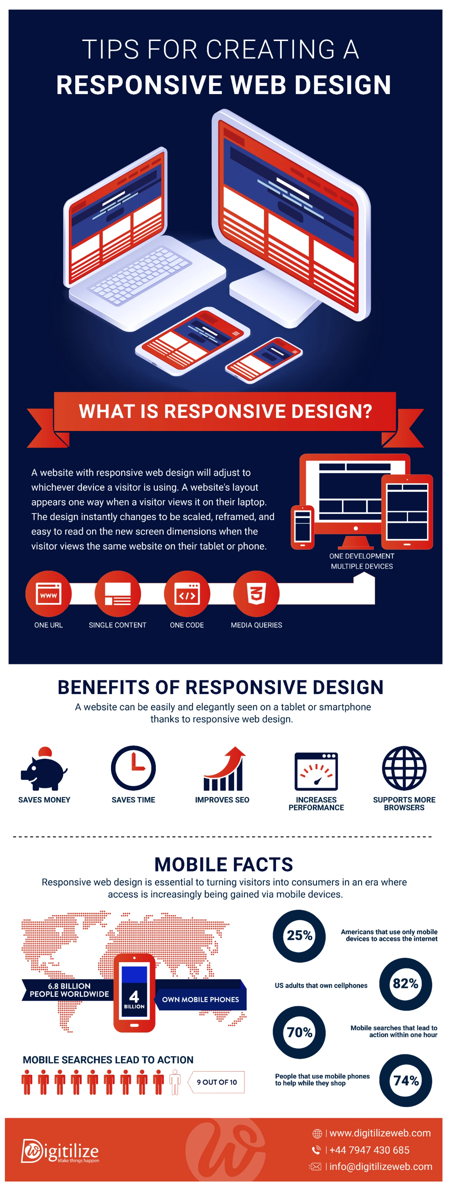
What is responsive design?
A responsive web design strategy helps your website look good on all devices. Whether someone uses a desktop, tablet, or smartphone, the site adjusts to fit the screen. It uses flexible grids, fluid images, and media queries. These tools make sure your content looks clean and is easy to read.
No matter the screen size or orientation, users get a smooth experience. Everything stays clear, clickable, and fast. With the right responsive web design strategy, your website works well everywhere—without extra effort from the user.
Benefits of responsive:
Responsive web design is essential for producing exciting and accessible user experiences in the always-changing digital realm.
Responsive design removes the need to build and manage separate websites for different devices. One strategy works across all screens, mobile, tablet, or desktop. This cuts down development costs in a big way. Businesses can save time and use their resources better. There’s no need for extra maintenance work on different versions.
A responsive design keeps your content consistent on all devices. You don’t need to create separate versions for phones, tablets, and desktops. One responsive website does the job. This saves you time during development. It also makes content updates easier. You only have to make changes once, and they show up everywhere.
Search engines can more easily crawl, index, and rank pages on responsive websites since they have a single URL and HTML code. This integrated strategy avoids content duplication and aids in higher
search engine optimization (SEO) ranks for websites.
This is necessary to increase website performance, reduce bounce rates, and provide a smooth user experience. A user interface may also be created precisely for the capabilities and specifications of each device, owing to responsive design. With this
optimization, customers can easily navigate and interact with the website, enhancing their overall enjoyment.
Responsive design makes your website work smoothly on any device. Whether someone visits from a PC, tablet, or smartphone, the site stays clear and easy to use. It also runs well on different browsers. You don’t need to worry about changes in technology. Responsive websites adjust on their own. This means fewer updates and no need for full redesigns. It saves time and keeps your website compatible in the long run.
Thanks to mobile devices, people now access the internet and engage with online content quite differently. Understanding the impact of mobile usage is crucial for businesses and web designers wanting to build a flexible web design.
- This emphasizes the importance and ubiquity of mobile-friendly web design in the current digital environment.
- Conversion rates are directly impacted by responsive site design. According to research, 61% of consumers are reluctant to visit a website again if they experience problems using it on their mobile devices.
- The main method for gaining access to social media networks is now mobile devices. Ensuring your website is flexible provides seamless social media integration, allowing people to share and interact with your content on numerous platforms easily
Conclusion
In today’s mobile-first world, responsive web design is a must. It helps create a smooth and user-friendly experience on any device. With the right design, businesses can stand out online. They can attract more visitors and keep them engaged. A flexible layout makes your site look great on phones, tablets, and desktops. By following modern design trends, you stay ahead in the digital market. Responsive web design helps your brand grow and connect better with users. To have this kind of success, do contact
DigitilizeWeb!

 The growing usage of mobile devices in today’s digital environment has changed how consumers access and engage with online information. Due to the expanding range of screen sizes and resolutions, it has become crucial for web designers and developers to build flexible web designs that smoothly adapt to various devices. DigitilizeWeb presented responsive web design, its benefits, and some intriguing mobile data through this infographic.